Task 3.1 – Practitioner Portfolios

This is a screenshot of a professional game artist’s portfolio, I tried to find game artists which specialized with UI, since that’s one of the paths I’m interested in.
- Layout and Navigation.
The layout of his portfolio is very straight-to-the-point it shows the mans name and profession in the title, it shows all of the stuff he has worked on, and it has different links to different parts of his portfolio, including a contact section where people can contact his work email and ask to work with him, it’s easy to navigate around the website, the images fading a grey colour as you hover your mouse over it to indicate that the mouse has scrolled over that button, and the different links to the different sections in his blog clear and bold at the top.
- Menus.
The menus are easy and everything is organised, there isn’t hundreds of submenus to go through, just a few main ones, which makes looking at his best work easier.
- Font type and colour.
The font he uses for the title and menus is minimalistic, nothing too crazy which would draw the readers attention away from the work he has worked on, the titles for the games below the images are in a simple font.
The colours Paul uses for the font is black, grey and red, nothing which is hard to read.
- Background colour or image.
The background image is just a simple white colour, this draws the readers attention toward the images of the games which he is working on, which is the main focus of his portfolio.
- Identify good and bad design.
It is too plain I feel, but in a way that is good as you don’t want anything over the top and too flashy.

This is a screenshot of a group of mangers and employees’ website who uploads different peoples portfolios to their website.
- Layout and Navigation.
The layout of this one I feel is better then Paul’s as it is a lot more centered on the UI that Pixune had made instead of the huge titles and the menus, I like how the images of the games are seamlessly tied together and you just scroll down, some of the images look weird since they’re in portrait mode which makes gaps in the website, the navigation for the website is rather easy, you have the portfolio, the home button and the ‘our story’ which explains what Pixune is and how to contact them, but I feel like a contact button would be more efficient
- Menus.
The menus for this is simple as there is only three, not hundreds of sub-menus leading to hundreds of different links, although some information regarding the contact information is unclear in the menu until you do some digging through the ‘our story’ section so I feel as if this could be improved on, another thing I feel could be improved on is the size of the menu, it is quite small in comparison to the images, so I just feel it should be a little more bold.
- Font type and colour.
The font used in the portfolio is fine, it’s simple and it’s nothing over the top and unreadable, you can read everything just fine and it’s black on white so you can see all of the text.
- Background colour or image.
The background colour is grey/white but it’s mostly covered up by lots of images in the portfolio which are stacked together tightly.
- Identify good and bad design.
I like the sleek look of the small menus but this could be a disadvantage if it isn’t bold enough.
One thing I don’t like is that the artists for the portfolios aren’t on their page, you don’t know who exactly done what, so you won’t be able to contact them.


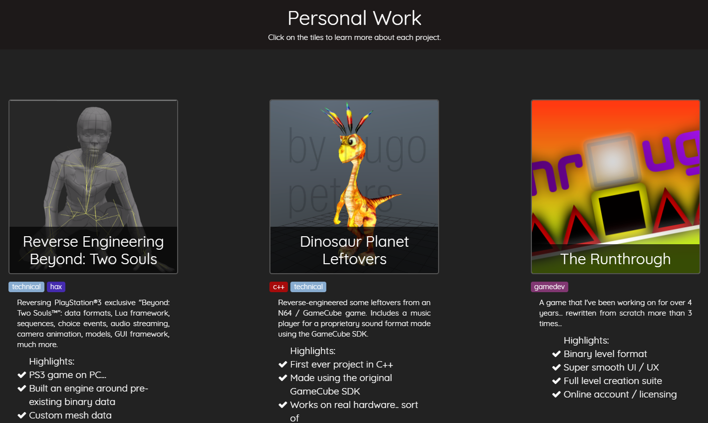
- Layout and Navigation.
The navigation around the website is easy, it pretty much shows you everything from the first page, and details it in simple bullet points and tags, and you can get more information on the projects by pressing them.
- Menus.
The menus are simple, bold and straight to the point with everything you would need to know to hire him, including a resume and contact information.
- Font type and colour.
The font he used is simple and easy to read with enough contrast to see the text.
- Background colour or image.
I really like how Hugo used a video of his games and what he has done as a banner for his page, it clearly displays from the get-go his abilities and what he has worked on, and I also like how he has a theme of colours for example, he uses dark blues, blacks and whites for the page.
- Identify good and bad design.
Everything I feel about his portfolio is good I haven’t got any negative points which I can see myself from his portfolio.
Task 3.1 – Portfolio Providers
WordPress
- Is it free?
Yes, WordPress is somewhat free, you can create your own WordPress website but if you have the free edition, you will always have ‘WordPress’ in your URL and at the bottom of the page you would have a WordPress watermark which you can’t get rid of unless you pay for your own website, the prices change depending what URL you want for the website.
There is different themes on WordPress, some of which you may need to pay for, some of them are free and the more fancy looking pages usually cost money.
If you really wanted, you can create your own theme, there is a way but it requires a hosting plan and extra software, so it requires a paid subscription, here is a tutorial on how to make your own theme.
- Does it look professional?
WordPress does look professional, but there is limited layouts you can do as you have to pick from one of the themes, the themes do look professional though, and there is hundreds to pick from, but is you used a common theme, it may be noticed, a lot would need to be changed to have a unique portfolio.
- Do they have an appropriate layout you like?
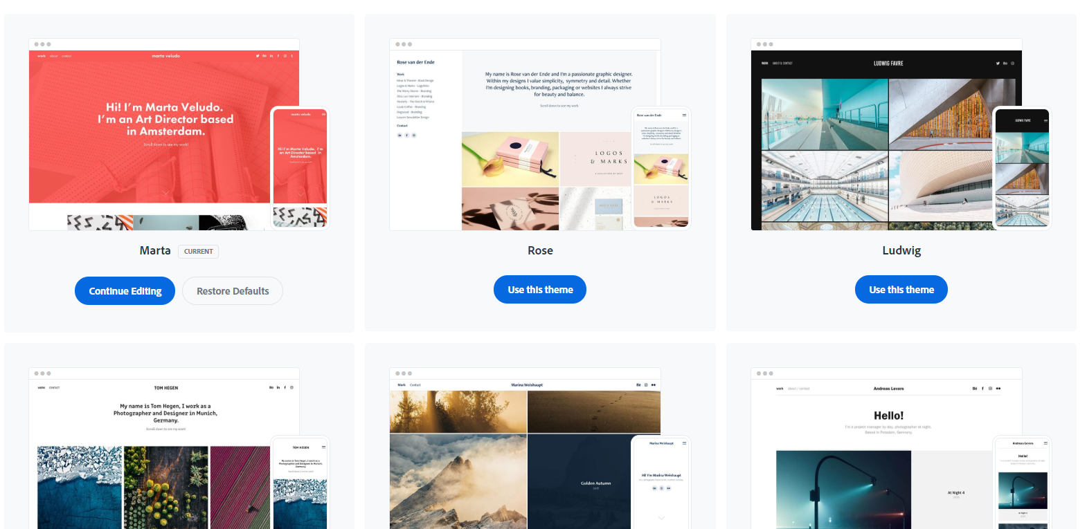
There are multiple layouts which I really like, but to activate them, I would need a business plan, which cost a lot of money per month which I don’t want to pay for.
So alternatively, I would have to use one of the free designs which are shown on the theme page for free, these are the ones which I can get and like the look of:


- Is it suitable for presenting student work e.g. finished work, sketches, life drawing, ideas generation etc?
Yes, WordPress is easy to use and easy to present work clearly.
WIX
- Is it free?
It’s free to make your own website with a watermark, but you need to pay for your own domain and to get rid of the watermark, you can get many different themes for free as well, in my opinion, I think that Wix’s themes look better then WordPress’s.
- Does it look professional?
With the Wix watermark plastered everywhere, I don’t think it does, but if I buy a membership and get rid of the watermark, it would look a lot better and a lot more professional .
- Do they have an appropriate layout you like?
I like these layouts:
- Is it suitable for presenting student work e.g. finished work, sketches, life drawing, ideas generation etc?
Yes, WIX is very simple to use, with the layouts above, I can easily present my work clearly and boldly.
Adobe Portfolio

- Is it free?
Yes, it’s free for people with a paid Adobe account – Which I happen to have so I can have a website without a watermark for free!
- Does it look professional?
In my opinion, I think it does look very professional, and it’s easy to present work on since it is specifically made to display your portfolio
- Do they have an appropriate layout you like?
There are only a few themes on Adobe Portfolio, and they’re all quite plain, but I feel, with enough of my own customization, I can make my own unique website.
- Is it suitable for presenting student work e.g. finished work, sketches, life drawing, ideas generation etc?
Yes, it’s simple to use, and you can also upload to your website straight from Adobe Lightroom, so it’s convenient too, I may end up using this one.
